As Open House Festival continues around London, a series of events are on the programme celebrating Croydon’s Central Library building and its striking design. Croydon’s first Central Library moved into the Clocktower in Victorian times (in May 1896 to be precise), but when walking past the building on Katherine Street, what we often forget is that the Clocktower Building inside is remarkably modern and was built in the nineties.
Designed by award-winning architect Mick Timpson, our current Clocktower opened in 1993. This Saturday (21 September) Mick will be hosting a walking tour of the building which will be a unique opportunity to hear about the strategy and design of not just the library, but the museum, cinema, galleries, café and more.
We were lucky enough to catch up with Mick ahead of his tour, to find out a bit about the story behind Croydon’s Central Library.
Croydonist: How did you go about designing a library for modern times that sat in a Victorian building?
Mick: Croydon has always been a fascinating place. The tension between its old town and new town areas provided endless inspiration for me as an architect. Over my career I have been lucky enough to have worked on a number of key urban projects and master plans in Croydon. While as a young architect at Tibbalds Colborne, the Croydon Library project was a significant one for us, representing a chance to create something truly unique for the town—something that wasn’t just a reflection of either the old or new Croydon but instead brought a distinct identity to the area. Importantly the practice led by Francis Tibballds and Chris Colborne was pioneering in developing a more urban design-led approach to architecture. This meant thinking about buildings not just as objects but as places shaped by the wider context, history and identity of their locality. Something that has stayed with me my whole career.
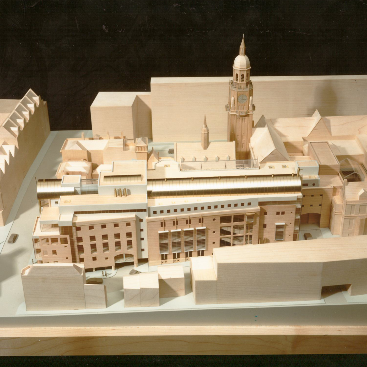
The idea behind the library was to establish a new public space that acted as a catalyst for transformation and regeneration in Croydon. It was a chance to create a real piece of urban fabric that would both acknowledge Croydon’s past and point toward its future. This library was my second design project in the area; prior to it, I had designed the Direct Line Insurance headquarters on Edridge Road, a standalone tower more in line with Croydon’s new town tradition. But with the library, I saw an opportunity to do something different—a chance to design an entire urban block that blended the old with the new, and at its centre, to create a space that was distinct, public, and welcoming.
Croydonist: Did incorporating old with new influence your material choices, and if so how?
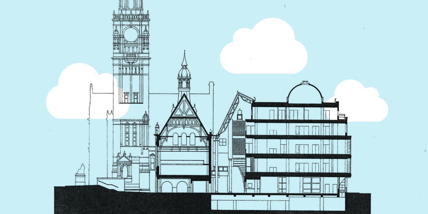
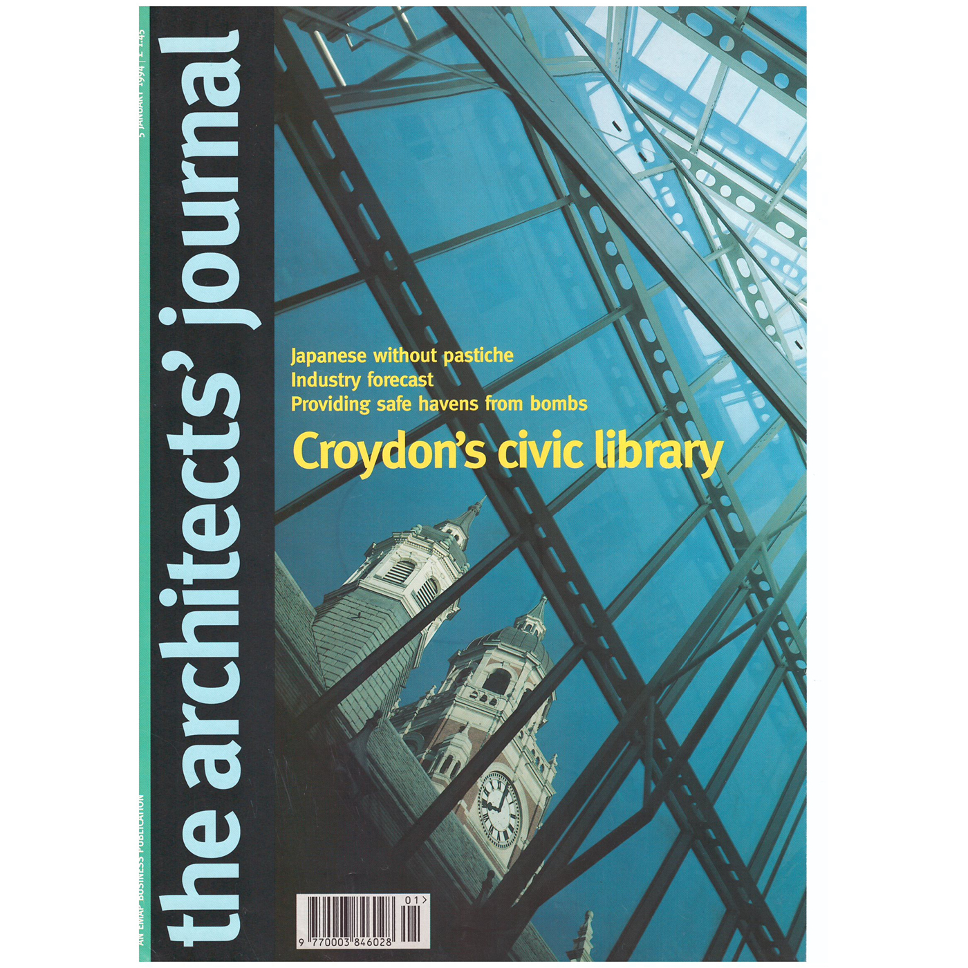
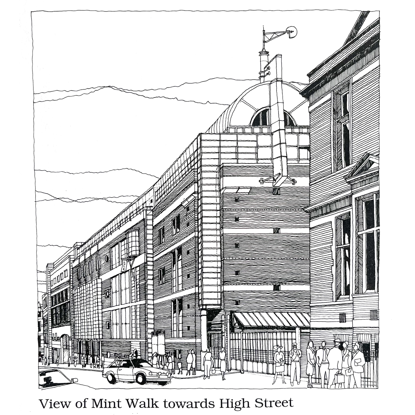
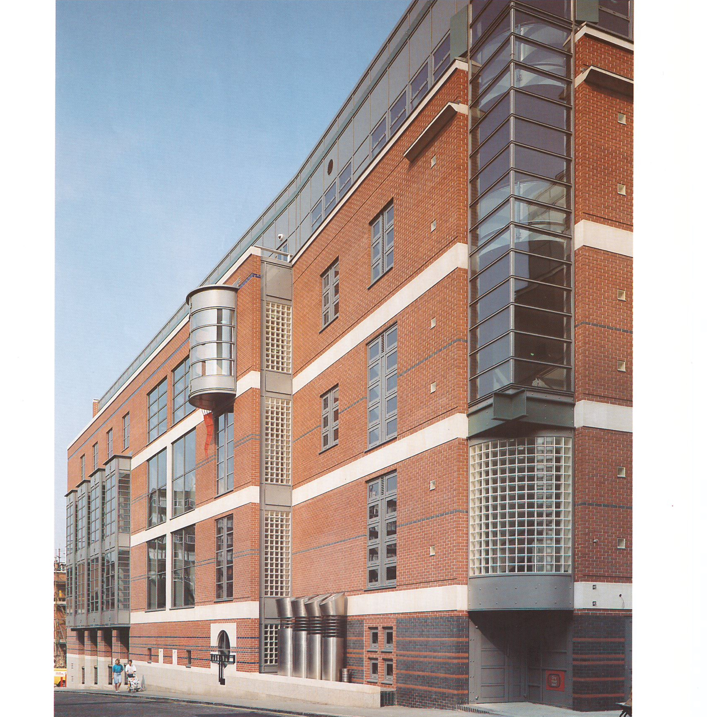
Mick: The design of the library wasn’t just about creating something new—it was also about responding to the history of the area, particularly the materials and forms of the original town hall. On Mint Walk, the library’s main façade references the red brick of the old town hall, though in a more engineered, modern way. We also incorporated Portland stone banding, echoing the detailing of the original Victorian structure. Inside, the main atrium was designed to be as transparent as possible, using plenty of glass to ensure that the old building could be viewed from within the new space, maintaining a visual connection between the two.
Interestingly, the Victorian architecture and particularly the town hall—focused much of its design attention on street-facing facades, leaving the rear more utilitarian. This gave us the freedom to create a new space with its own identity while ensuring a visual link between the old and new buildings.
Croydonist: What was the design strategy behind the new Clocktower?
Mick: One of the most exciting aspects of the library project was the opportunity to test and implement a series of urban design tactics that we had been developing in the practice. We were pioneering the integration of architecture and broader urban conditions, and this project allowed us to explore that in depth. One of our goals was to complete the urban block in a way that was legible and clear, helping create coherence within the street fabric.
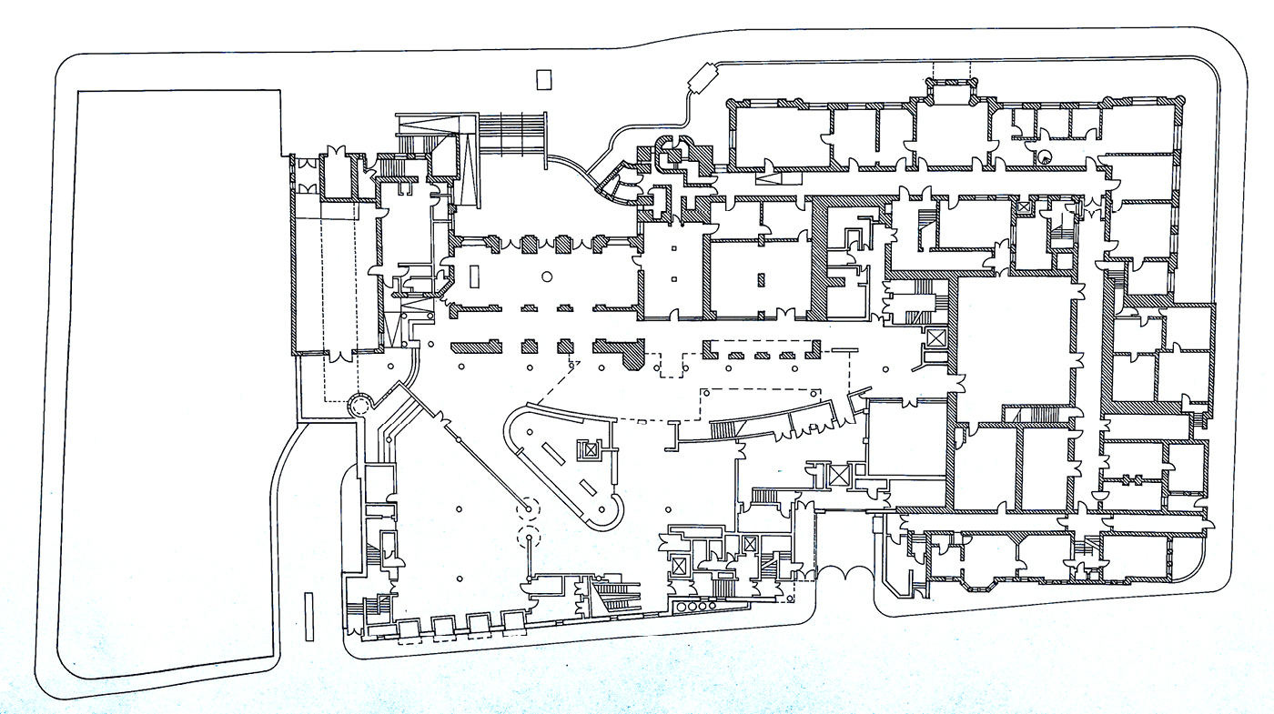
One of the standout elements of the library’s design was the multifaceted brief, which included not just a library but also a cinema, museum, gallery and other cultural uses. This allowed for a deeper exploration of how a public space could become a place of real identity for Croydon. It’s fascinating to think that this project was conceived before the internet era; if we were designing the building today, its functionality would be very different. But at the time, the design revolved around creating a central public space—what we called the ‘court’—while completing the geometric legacy of the original Victorian buildings surrounding the site. At the time, Croydon had limited urban public spaces, and we wanted this to be a model for future development. It was essential that the space felt open and accessible, with a seamless connection between the Victorian and modern buildings. This idea of fluidity between old and new informed much of the ground-floor design, creating a space that was both visually and spatially integrated. A key design feature that emerged early on was the glazed curved wall. This was a direct response to the clock tower, an important visual and cultural landmark in Croydon. We wanted to ensure that the clock tower remained a focal point, with its impact felt across all the new library spaces.
Croydonist: Can you tell us a bit about the design of the children’s library – I’ve always wondered what the circular room is for that juts into the café for example?
Mick: Designing this building came with its fair share of challenges. The London Borough of Croydon was aspirational in its vision for a public facility, and the librarians were forward-thinking in their approach to creating a more dynamic type of library—something more akin to what we see today. However, balancing access, security, and openness was a constant challenge. We had to ensure the library could be secure while maintaining a sense of openness and public engagement.
The children’s library, however, gave us a chance to have a bit more fun with the design. Inspired by Maurice Sendak’s Where the Wild Things Are, we embraced the idea of the library as a child’s journey. Working with artist John Mills, the design incorporated playful elements like a lighthouse, metal trees, and even little “portholes” that peaked onto little cut outs of boats and ships incorporated into the basement car park grilles. The circular storytelling tower was intended as an intimate space where specialist storytellers could engage with younger readers. We had this idea that children could be safely contained in the storytelling hut, while parents enjoyed a cappuccino in the cafe just next door.
Croydonist: What is your favourite part of the Clocktower design?
Mick: Asking an architect to choose their favourite part of a design project is always difficult, especially after 30 years. I recently finished designing and building my own home, and I often find myself reflecting on why I made certain choices. With the Croydon Library, I am extremely proud of what we achieved as a team. It remains a landmark in all our careers, even though, with the benefit of experience, I might approach things differently now. If I were to design the building today, I think it would be a bit quieter, less complicated, but still striving to create that sense of place and identity.
Croydonist: What was the most challenging aspect of the Clocktower design?
One of the most challenging aspects of the design was the Mint Walk façade. It took time to get the composition right, as it’s never seen directly head-on but rather obliquely from the street. The aim was to create an engaging street scene that would unfold as people moved along the walk.
Croydonist: We’re now over 30 years on from when the building opened – is there anything different you’d do now, if you were designing it for today’s users?
Mick: If we were designing this library today, the brief would likely be entirely different. In those pre-internet days, the library spaces were designed like office spaces, with raised floors for plugging in computers. Today, the way we consume information has significantly changed. It demands perhaps a more ephemeral experience designed for shorter attention spans which perhaps demands less architecture and sense of place than we set out to convey in Croydon. Yet, despite these changes, there’s something irreplaceable about the experience of handling a real book—a joy that remains fundamental to human experience which I hope the building we designed nurtures.
Looking back, the Croydon Library project has a handmade, human quality to and sense of joy that I hope people still feel when they use the space. Every part of the building was drawn by hand before going into CAD. We built large card models in the office and together created an inspirational team which included a client and a local authority that were really inspired to see what public architecture could do. It’s unlikely we’ll see another project like this, especially one spearheaded by the public sector, but I’m grateful to have been part of it. It stands as a testament to a time when public architecture was about creating something lasting, something that would help shape not just the skyline but the community itself.
A huge thanks to Mick for chatting with us.
There may still be a few spaces on his walking tour of the Clocktower, this Saturday 21 September, as part of Open House Festival. For more information see the listing here. For more on Mick’s practice check out his website.
Images courtesy of Mick Timpson and Croydon Central Library. Header image, modified by the Croydonist.
Posted by Julia


No Comments